
Learn About the Effects of Cool and Warm Colors in Interior Design
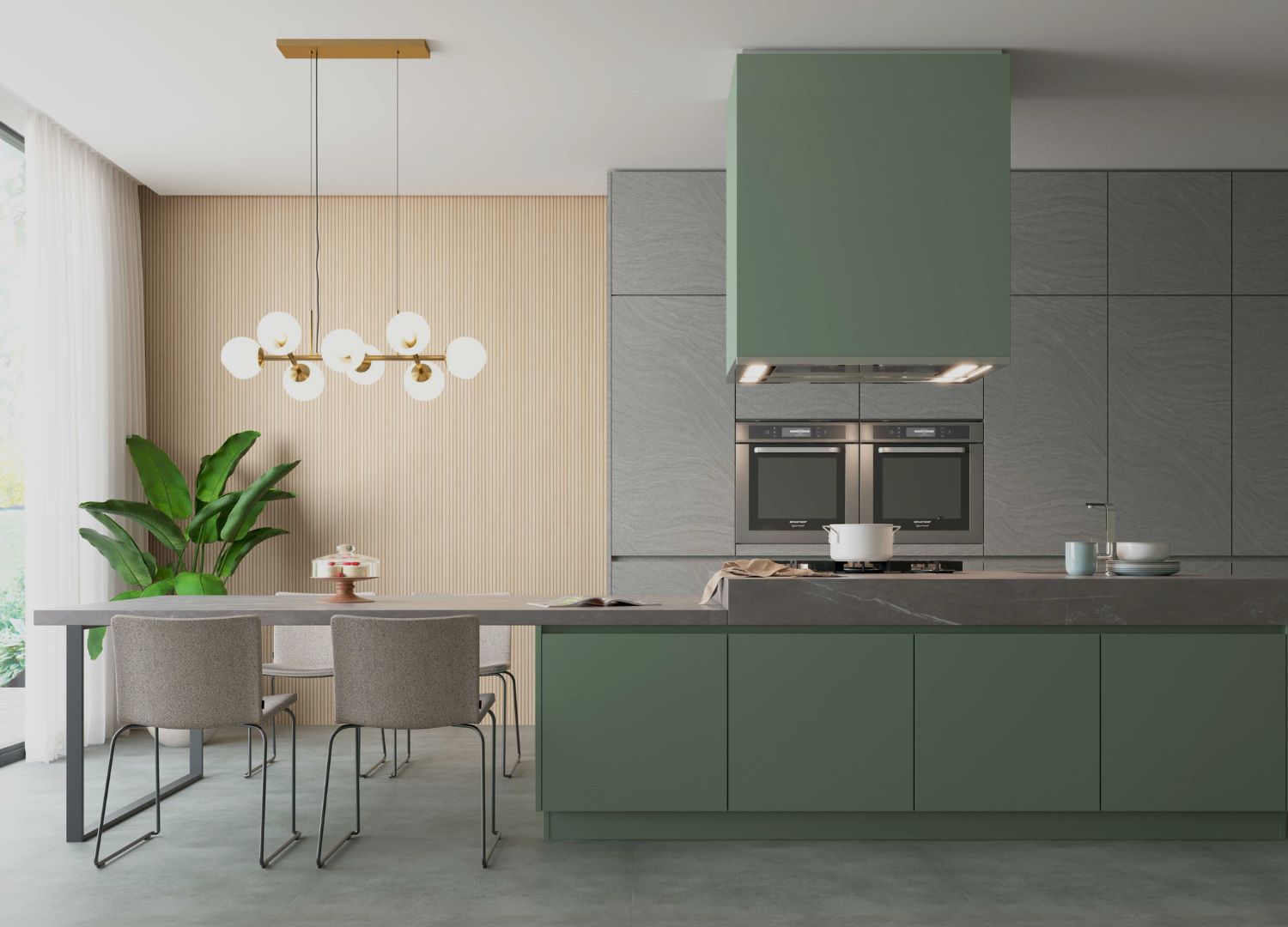
Do you know what cool and warm colors are? We can say that warm colors are those that have a greater amount of yellow pigment in their composition, and therefore have a more yellowish undertone. Cool colors, on the other hand, have more blue pigmentation and, consequently, a more bluish undertone. Therefore, violet, blue, and green are considered cool colors, while yellow, orange, and red are warm colors. Check out the post to learn more details about how this affects your home decor!
How Did This Concept Come About?
It was created by the German Wilhelm Wundt, one of the founders of experimental psychology. His goal was to discover what sensations colors cause in people. To do so, he classified the shades according to their temperature.
How Are Cool and Warm Colors Classified?
When we talk about warm colors, we have red, orange, and yellow, shades that convey a sense of warmth. On the other hand, we have cool colors, which we consider to be more “calm” colors: blue, green, and violet.
It is important to evaluate the shade of each color because, starting from the basic tones, we can obtain an infinite variety of them. Thus, the same color, for example, can have a warm undertone or a cool undertone.
What Is the Importance of Warm and Cool Colors in Architecture?
Several studies have already been conducted and have confirmed that colors affect our mood, attention, disposition, among other characteristics.
When we talk about architecture, we must take into consideration that colors can create various sensations in environments. This is one of the factors that most influence how we relate to a particular environment. Colors are capable of stimulating our senses to perform activities such as work and study.
Warm Colors
Yellow is associated with optimism and stimulates creativity and confidence, in addition to conveying a sense of warmth, energy, and vitality. It is recommended for adding a touch of color to dark environments without windows.
Red, on the other hand, is considered stimulating, so we should use it with caution. For a harmonious environment, the ideal is to always combine it with more neutral tones.
Orange is a color that brings joy to the environment and lifts the mood. It is highly recommended and used in work and study spaces.
Cool Colors
Blue stimulates relaxation, which is why it is widely used in bedrooms and resting environments.
Green creates a sense of security, serenity, and hope. In lighter shades, it is considered relaxing and is widely used in bedrooms, living rooms, and offices. In darker shades, it conveys a sense of seriousness and security.
Violet is related to our spiritual side and conveys an idea of wisdom and respect. It is a color more commonly used in peaceful environments, such as bedrooms or meditation areas.
Thus, colors directly influence our feelings. Therefore, it is necessary to take some precautions when it comes to interior design. Ideally, stimulating colors should not be applied in resting areas, just as cool shades should be avoided in environments that require greater attention, such as offices and study rooms, because they are more relaxing.
Therefore, it was possible to see how cool and warm colors affect us and, for this reason, they should be taken into consideration when applying them to the interior design of a property.
Did you enjoy the post? Share it on your social media!